项目性质是一个潮流品牌饮品店,品牌客户群体主要为年轻潮流人士,设计师初步希望将此店结合旧时回忆,创造一间能够继续引领这条旧街道潮流的潮店;同时也希望能结合HI-POP品牌的理念,通过设计来升级店面的形象,长远的提升HI-POP的社会认知度。
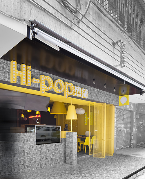

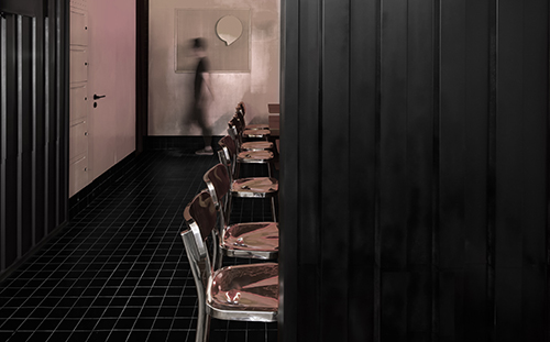
设计概念来源于儿童时饮碳酸汽水时用饮管饮汽水的那种爆发感觉,充满甜味,充满气体的液体由口中瞬间进入,经过食道到达深处,然后打一声“嗝”,这爽快感觉是小时候最大的满足。基地室内空间为一个长方形规整空间,主要运用了黄色与黑色两个盒子空间体块space block的联系构造,天花用吸管元素装置由门口一直延伸进去室内最深处,串连黄色与黑色盒子,就像饮汽水时充满味道与口感的爆发一样,直入空间深处。地面到墙身的体块采用了素描图案的花砖,令人回想起学生时期百无聊赖,浮燥时用铅笔在纸上乱画圈圈的感觉。三者结合交织,空间相互穿插,加上简单却古怪的怪物公仔图案,潮流公仔的点缀,创造出一个令消费客户能回忆过往的空间,整体氛围也令人情绪活跃、潜意识地加快客人进餐的速度,从而提高店内的客流量,符合当今快时尚餐饮空间的商业运作模式。
项目地点:广东佛山


设计概念来源于儿童时饮碳酸汽水时用饮管饮汽水的那种爆发感觉,充满甜味,充满气体的液体由口中瞬间进入,经过食道到达深处,然后打一声“嗝”,这爽快感觉是小时候最大的满足。基地室内空间为一个长方形规整空间,主要运用了黄色与黑色两个盒子空间体块space block的联系构造,天花用吸管元素装置由门口一直延伸进去室内最深处,串连黄色与黑色盒子,就像饮汽水时充满味道与口感的爆发一样,直入空间深处。地面到墙身的体块采用了素描图案的花砖,令人回想起学生时期百无聊赖,浮燥时用铅笔在纸上乱画圈圈的感觉。三者结合交织,空间相互穿插,加上简单却古怪的怪物公仔图案,潮流公仔的点缀,创造出一个令消费客户能回忆过往的空间,整体氛围也令人情绪活跃、潜意识地加快客人进餐的速度,从而提高店内的客流量,符合当今快时尚餐饮空间的商业运作模式。

项目地点:广东佛山
项目性质:餐饮
设计面积:50㎡
设计公司:肯斯尼恩设计
设计团队:陈协锦、文伟、熊丽芬
主要材质:素描花砖、黑色格仔砖、镀锌板、喷漆、实心圆铁条
设计时间:2016.3
完工时间:2016.6
项目摄影: 欧阳云
The project is located in an old street full of nostalgia and memories of childhood. It is called CD street. A place filled with CDs, toys and elaborate works; a place where the local post-80s will never forget and a place where local trend started in early 90s. Today, it is no longer bustling; there is no student fashionista and no smell of memories. In this fast developing era, while top buildings are booming up, streets of old neighborhood fall quietly. Without past bustling and song of HK idols, there is more silence, but memories never die…
The project is a fashionable brand drink store whose target customers are mainly fashionable youths. The designers’ first idea is to build a fashion store to lead the tide of fashion of this old street through integrating old memories into the store. The designer, at the same time, wants to combine HI-POP’s brand concept to upgrade the store image through design, so as to increase its social awareness in a long term.
Design concept is derived from the outbreak of cool feeling when we use tube to drink carbonated soft drinks in our childhood. The sweet, gassy liquid goes into our month instantaneously and goes deep through our esophagus, and then a “belch” is made, this cool feeling is our biggest satisfaction as a child. Indoor space of the site is a rectangle space which is built mainly by connecting two space blocks-a yellow box and a black box. The ceiling is decorated with tube element which extends from the entry to the deepest interior space and connects the yellow box and black box .It reaches the deepest place of the space, just like the burst of taste and texture when we drink soft drinks. Blocks of the floor and wall use encaustic tiles with sketch, which makes visitors remember how it felt like doodling circles on paper during their boring school days. The combination of the two blocks and ceiling, and the interweaving of spaces, together with the decoration of simple but strange monster dolls design and fashionable dolls; a space which could make customers recall the past is created. The whole atmosphere keeps customers’ spirits up and increase subconsciously customers eating speed. Guest flow of the store is increased in this way, and such design fits the business operating mode of today’s fashionable food and beverage space.


